Zscaler
Digital, Interactive / 2019Creative Direction, Art Direction
Agency Critical Mass
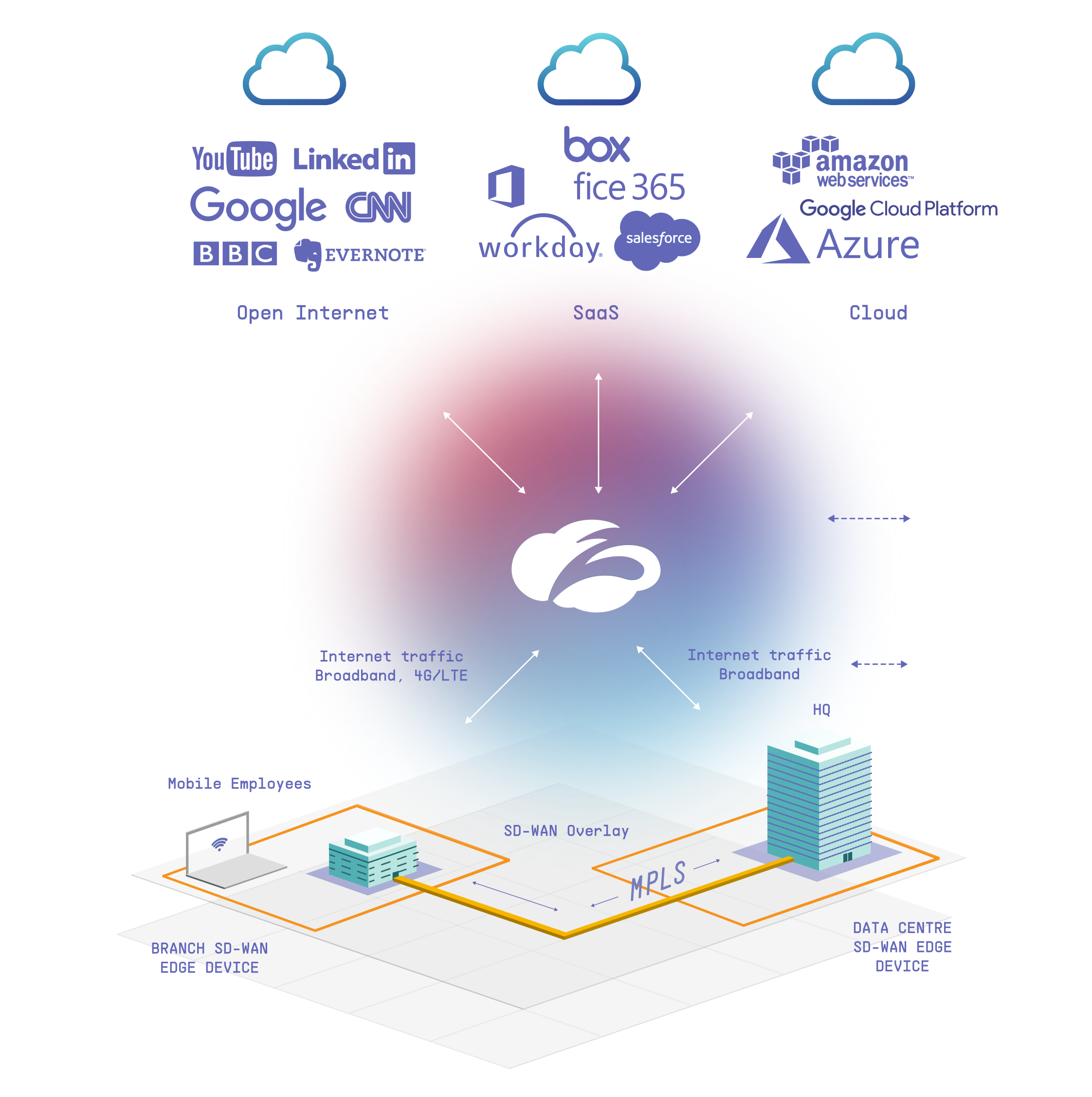
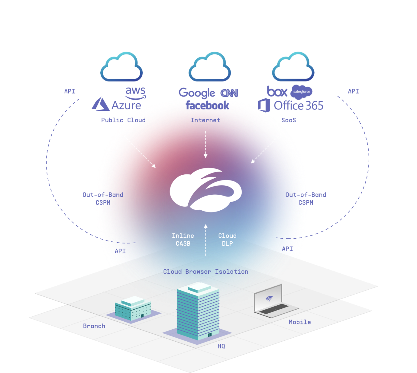
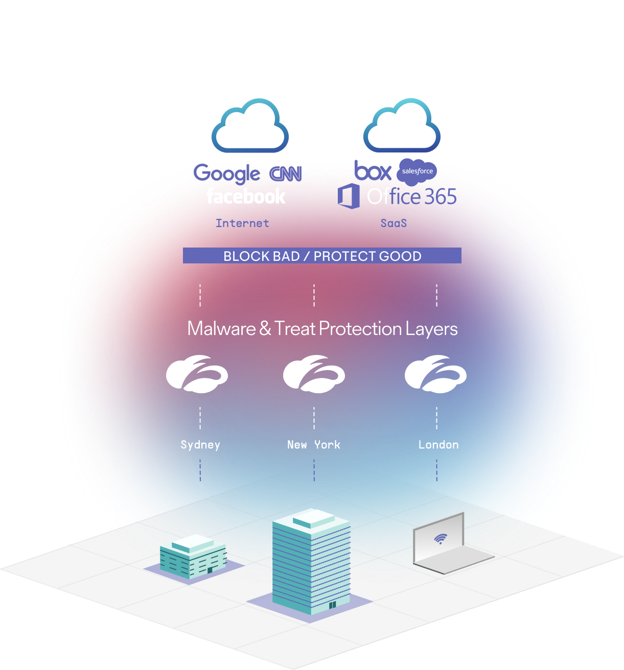
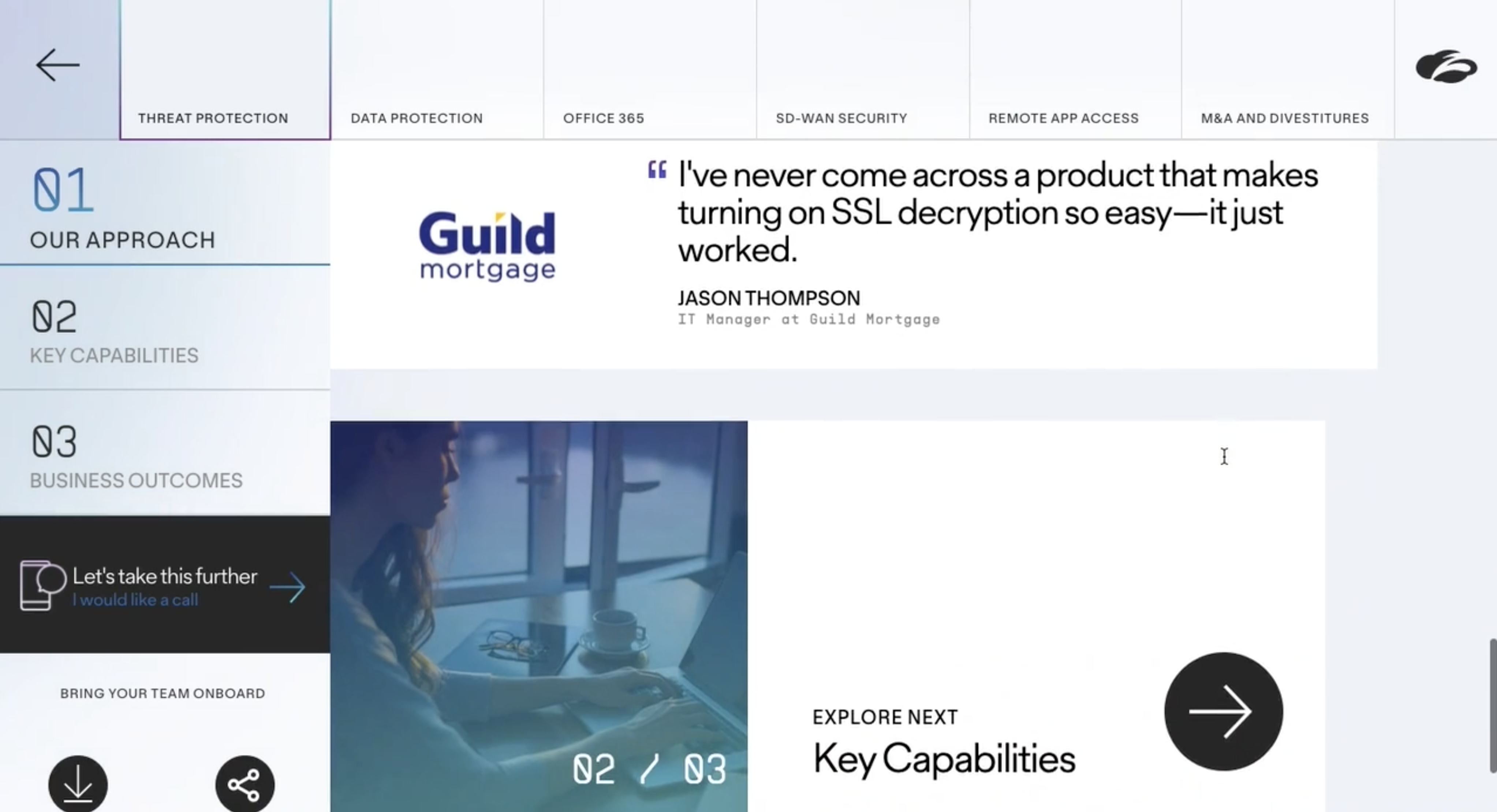
We were approached by the Zscaler team to build a dynamic and interactive sales tool for their growing business. In the spirit of selling, we pitched them on an elevated brand experience that utilized brand elements in a contextual way, built an entirely new design system, designed an isometric diagram style, and updated their typography.
We leveraged Zscaler’s gradient system as a launchpad to build an atmospheric system that represents the cloud in a contemporary way. Using gradient shapes (blobs) in both static and motion executions, we created a dynamic and evolving system that represents fusion, transformation, and approachability. We contrasted the gradients with big, bold typography mixed with solid grid elements. We explored a full spectrum of colour gradients to represent products and features contextually within a larger system.

The moodboard set the direction for a highly technical and typographic framework with gradients juxtaposed, floating freely throughout.


Watch a demo of the tool:
We built a tablet first, locked UI interface to enable sales reps to walk through demos easily and efficiently.
![]()
![]()
![]()
![]()

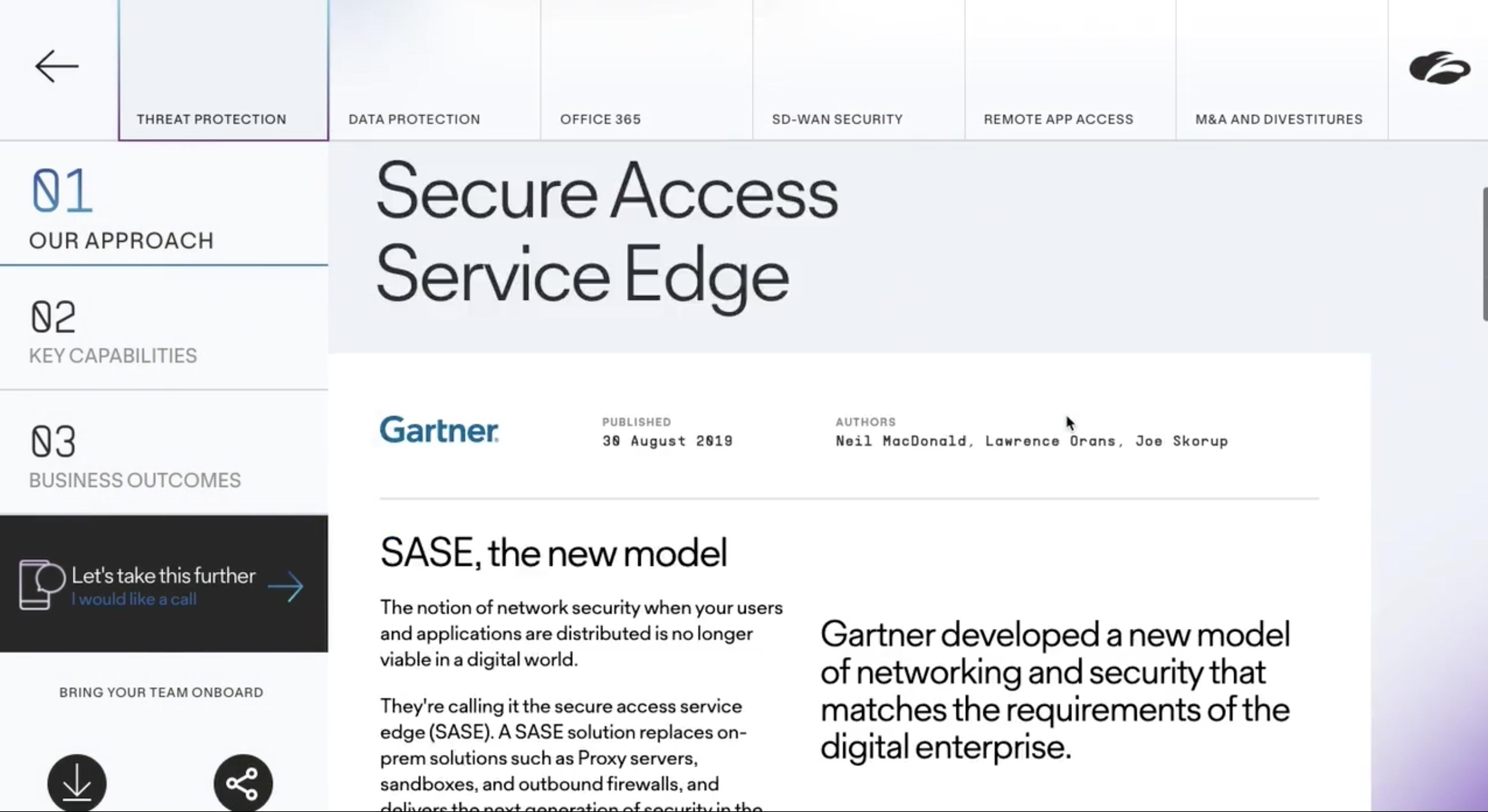
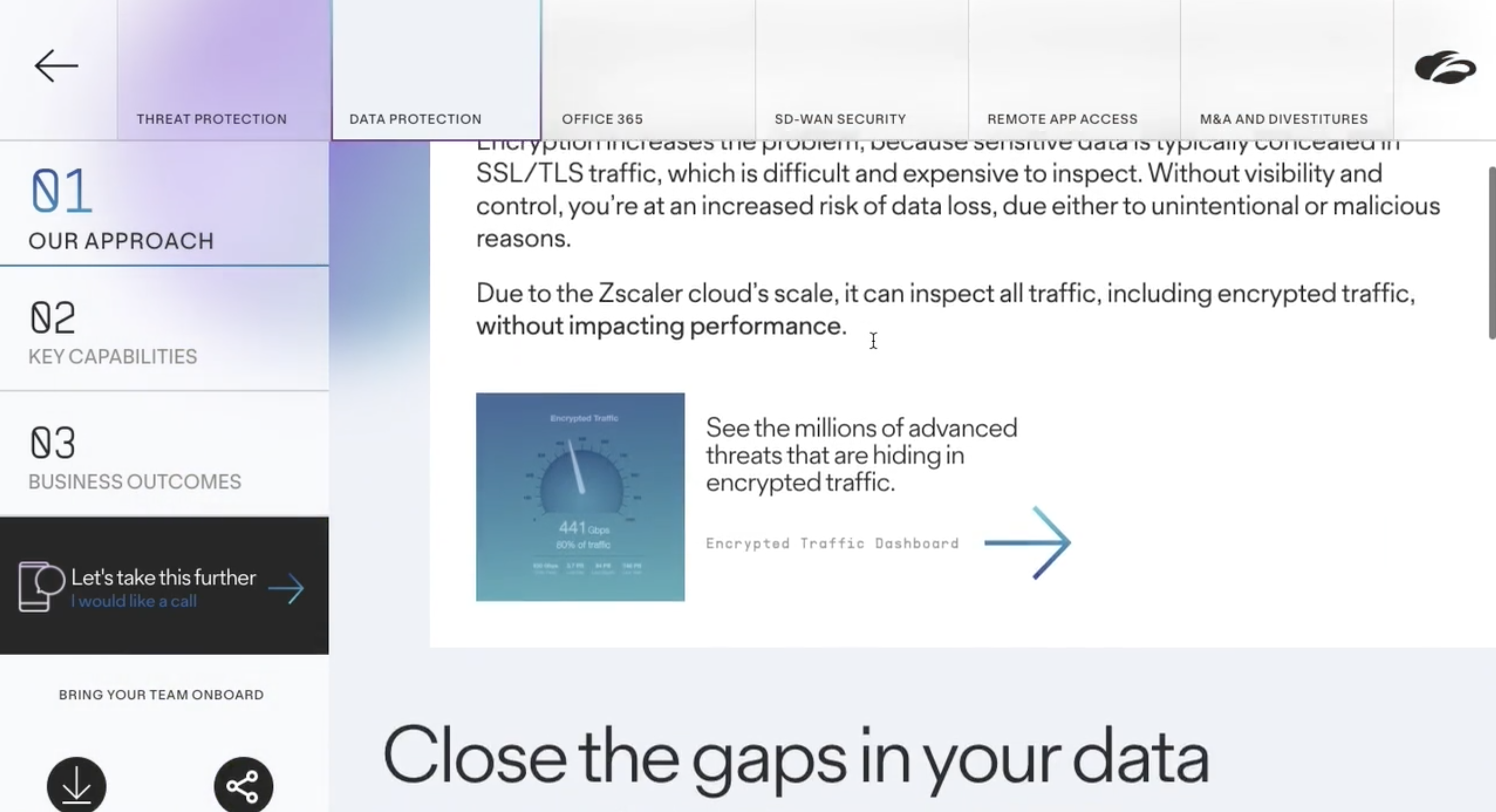
The gradient blobs freely and ephemerally floated slowly throughout the experience to give life to the content.


